Pages

Wednesday, December 28, 2011

Mirror, Mirror on the Wall

I love mirrors.

When I lived in Australia, I moved around a lot. But there's a common denominator for all the bedrooms I lived in: they all had built-in wardrobes with sliding mirrored doors. I loved how much larger the space looked with the mirrors. Plus it was lots of fun when I brought home a cute little kitten, who kept trying to pick a fight with its identical twin in the mirror.

Because we live in such a small space, I'd love to use many, many mirrors to create the illusion of a larger place. Vee is worried about overkill, though. So I went on a quest (online) to ask the oracle (Google) for some much-needed advice regarding The Appropriate Number of Mirrors. How many mirrors is too many?

Sadly, there seems to be no guidelines on the matter. Does this mean we can just place mirrors anywhere, willy-nilly?

HGTV apparently thinks so: "Designer Jennifer Duneier believes you can never have enough mirrors in a home."

And Jonathan Adler seems to agree: "You can never go overboard (or wrong) with reflective surfaces. They add twinkly glamour, light and the illusion of space."

So, seriously? We can place as many mirrors as we want? Really? REALLY?

Then explain this:

For a wacky hotel experience, try the Propeller Island City Lodge in Germany.

To be fair, the mirrors do add light and illusion of space. And glamour, really, is subjective. But I don't want our home to look like that.

Currently, we have a total of four mirrors. One in the bathroom, obviously.

Ugh, can't wait to renovate the bathroom!
One over the fireplace. I love this mirror; I think it's so sexy and masculine with its chiseled angular features. And I got it from Craigslist for like $30! (Hmmm... somehow I feel like I'm describing a cheap, beautiful man-slut...)

It bothers me that this awesome mirror reflects the hell out of the outdated light fixture and textured ceiling.

One in the entryway... This curvy girl I snatched on sale for $20 at Ikea.


And this one in the bedroom behind the bedside table. It's a plain mirror with no backing and no frame. I got it from a garage sale held by a nearby 55-years-and-older condo community. A grey-haired gentleman volunteered to wheel the mirror down the street on his cart and in the process, chipped a corner. When it happened, all these seniors had already made a big fuss over how they would transport this mirror...so I didn't have the heart to cancel the purchase.

Chipped bevel! Tragic :'(
My Google search did help give me ideas on how to add more reflective surfaces. I particularly like this Apartment Therapy article, which has some serious eye candy.

We could group the mirrors together for some variation...
via Apartment Therapy
...use them as backsplash in the kitchen to help reflect light in the dark corners underneath the top cabinets...
via Apartment Therapy
...or even stick them onto cabinet faces for a truly unexpected twist!
via Apartment Therapy

Sunday, July 24, 2011

Ikea Hack: Ivar Wardrobe

This is a project we're very proud of. It's still a work in progress, but it's looking pretty damn good if you ask me.

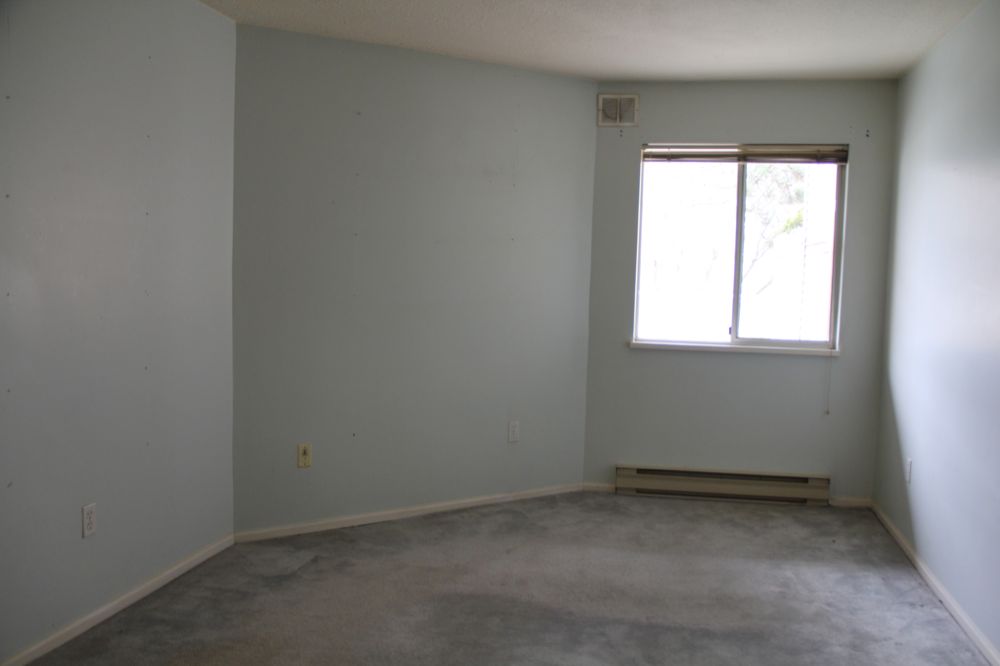
Behold, the closet space before we did anything to it.


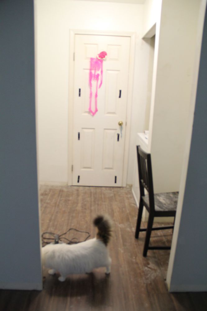
Yes, that's a pink skeleton. No, it's not a glow-in-the-dark pink skeleton. I checked. I found it on top of the dryer. As can be seen in the photo, I promptly sent my best detective to investigate. She suspected it to be part of a Halloween decor, which climbed all the way up there just because high places are awesome.

The walls in the walk-in wardrobe were white even though the walls in the adjoining bedroom were pale blue. I don't know why the previous owner insisted on squeezing the entire color spectrum into this tiny apartment.

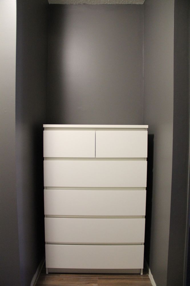
We painted the bedroom and the wardrobe Benjamin Moore Kendall Charcoal to improve the "flow" between the two rooms. Then we placed an Ikea Malm dresser smack dab in the middle of the long wall.


Yep. Bad decision. It was the wrong size for the space. Good thing it fit in the small corner beside the stacked washer and dryer, so it will stay there until we figure out what to do with that corner.


Meanwhile, we sorely needed hanging space. We hunted down some Ikea Ivar parts on Craigslist and found a deal. It was dirt cheap at $55 (delivered!) and we got literally a big heap of it. It would easily cost hundreds of dollars new at Ikea. But there was a catch. They were painted blue, had doodles on them and were just an unintelligible  mess.

This is only about half of what we got!
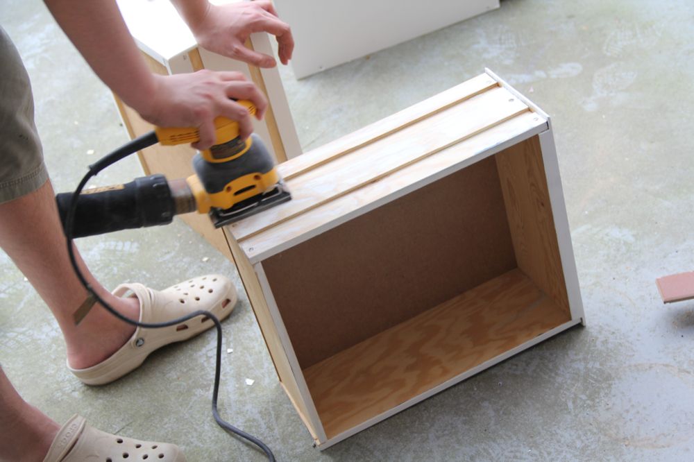
So we chose the Ivar parts we wanted to use, then got a Behr paint from Home Depot in a white color similar to the one on our Ikea Malm dresser. After sanding, primer-ing and painting the Ivar parts, we started assembling our wardrobe tower. This went in the middle of the long wall in the closet.


It wasn't that easy to assemble, though. This was where we started wishing that we bought a brand new Ikea Ivar set like normal people. But since the two frames alone would have cost us $50 new, we shut our mouths and got to work.

First, the drawers wouldn't slide in. I think the previous owner left them outside and they expanded.


After some vigorous sanding sessions, these drawers finally slid into place.


And the hardware for holding the drawer unit up above the floor was missing. We went to Ikea to look for it, but they couldn't give us the hardware without a receipt, which of course we didn't have.

So we got ourselves some metal L-plates and screwed the drawer unit into place. We used eight brackets, one for each corner of the drawer unit that met the frame. You can see one of those brackets in action below.


We then prepared the shelves that we wanted to attach out Ikea Ivar tower. We wanted to use a mixture of Ivar shelves and our own custom shelves. The Ivar shelves obviously would only fit the main middle tower. So we had to make our own shelves to span the length of the top of the entire unit and the two spaces on either side of the main tower at a lower level. It's sounds complicated, but it's really quite simple. Read on and you'll see what I mean.

We got some pine planks and cut them to size. Because we wanted a long piece at the top and couldn't find a plank that size, we used two pieces and held them together with metal plates.


Then we painted the pine planks the same white color as the Ikea Ivar to make them blend together.

Same white color as the cat?

After that, we went about installing rods for our clothes hangers. Because the set-up is a little difficult to explain, here's a picture to show you how we did it.


We first screwed metal L-plates into the wall studs at the height we wanted. Then we placed a length of 1.5" by 1.5" wood  onto the L-plates and screwed the wood into place. We attached a shelf to the piece of wood and also to the Ikea Ivar tower. We placed a U-hook near the each of the two ends of the shelf and threaded a length of wood dowel between the two U-hooks.

See? You would never understand how it's set up just by reading my explanation. Here's a bigger picture.


We matched the heights of the shelves with the rungs on the Ikea Ivar frames so those rungs could help keep the shelves in place. We also used L-plates to attach the shelves to the Ivar frames for more strength.

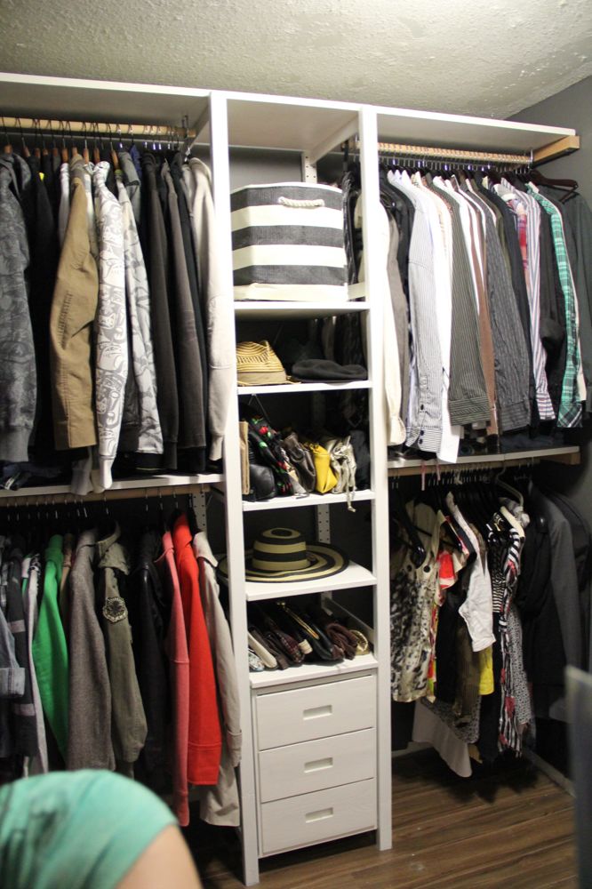
After all is said and done, we're really happy with the end result.


That's my arm in the bottom left corner — tight space!

What I was most excited about was getting all my bags out of the moving boxes and having them on display.

And I love that we can change the heights of the Ikea Ivar shelves. We can switch the things we put on each shelf and adjust the heights accordingly. We have summer hats out now, but we'll be able to place winter stuff there later and still have shelves that are just the right height.


I also love how tall the whole thing is; it almost reaches the ceiling.


Adding a rug made the room feel more finished. That's an Ikea Farum rug, by the way. We bought it half price at $29.99. Boy, this post makes us seem uber cheap.

All in all, this project cost us a little over $150. We spent $55 on the Ikea Ivar, about $60 on the pine planks, about $30 on paint (which we still have plenty of and will use on other things) and about $20 on the wood dowels, supporting wood pieces and hardware.

That's not too shabby, considering the unit is really big and all made of solid wood. Similarly sized melamine models would easily cost five times that. And did I mention this was the first time we tried our hands on carpentry? We're patting ourselves on the back. I mean, it used to look like this:


And now it looks like this:


That's something. But I said the room isn't quite done yet and that's because there's still plenty of things I want to do.

I want to add some lights on top of the unit because the lower shelves are really dark. The space between the top shelf and the ceiling is just the right size for that. I also want to add some drapes to separate the bedroom and the wardrobe, and also to cover the washer and the dryer. That Ikea Malm dresser is also too small for the other corner of the wardrobe. And what's a closet without a mirror?

Wednesday, July 20, 2011

Mini Project: Entryway

We're still saving up some money and gathering up some willpower to do large projects, like the baseboards. Those baseboard-less walls, they stare at me every day and laugh at my incompetence. One of these days, we'll cover them and shut them up for good.

For now, it feels good to just relax and take things one at a time. It feels good to be able to sit down and watch some TV after work and not have to rush to do some DIY work before it gets too late to make some DIY noise.

So we have been focusing on things we can do easily, cheaply and quickly.

When we moved in, one of the things that bothered me was this tight entryway.


That was the door to the apartment behind me. As you can see, you are faced with the wall once you open the door, and you have to walk slightly to the left to enter the living area.

As you can also see, the walls were all different colors in the living room, entryway and kitchen. Crazy for such a small apartment. Good thing we also killed all the other colors when we killed the orange.

Here's another view of the spot, as seen from the kitchen. We removed the mirror when we painted and were left with this blank canvas. That's the door to the bathroom, by the way.


I hated having that awkward wall greeting me every time I came home, so doing something about that corner ranked pretty high on my to-do list.

I decided that a tiny table would be awesome in that corner. And the table had to have rounded edges so people wouldn't bump into it. I took the measurements and had a very specific idea of the kind of table I wanted. After going through table after table that were either too big or too expensive, I found this on Craigslist:


Originally $39.99 from The Canadian Superstore and sold, with a chair, for $20 on Craigslist.

Here she was in that ugly corner, looking all lonely and desolate. She looked like she needed some friends.


Because we seemed to keep losing our keys, we installed this magnetic-message-board/key-hooks nearby. I got it at Nood's big annual sale for $17.50 (down from $59.90).


I also added a little bowl for sunglasses. It's summer and I hate squinting.


The same night, I found out that Ikea was having a summer sale and they had the perfect mirror for the spot. Down to $19.99 from $39.99. Voila, our awkward corner was now functional.


A little accessorizing, and this was what we ended up with: a prettier sight to come home to.


 Let's hope it helps us gather enough willpower to do the baseboards after a long day at work.

Tuesday, July 12, 2011

Killing the Orange

When we moved in, we knew the orange in the living room had to go. I know orange can work if you do the decor right, but it's not us. In the overused words of romantic comedies, "Sorry orange, it's not you, really, it's us." But I like Godfather more than Sleepless in Seattle, so, "It's nothing personal, orange. It's just business...BANG!"


We wanted a neutral color, but weren't fussy about which neutral color. So, like the amateurs that we are, we marched to the mistint section in the Benjamin Moore store and chose a color, any color, that looked tame.


See? The definition of tame.

I said to the lady working at Benjamin Moore that it seemed like a nice color and she had this funny expression like she wanted to say something but felt like she shouldn't. That should have been our clue.

Vee finished up putting primer on the last section of the wall, while I started cutting in on one wall. The first stroke scared me because the paint in the can was totally a case of false advertising — there was no way it was that same tame color! But I told myself how the color in our bedroom (which we thought and thought and thought about for weeks before making a decision) seemed scary at first, but worked in the end.

No amount of talking to myself could convince me, though. So I decided to paint a big section to see what it really looked like. Behold:


Definitely not tame. It was closer to orange than we would have liked. And it looked like mud.

So we looked at some paint samples we had at home and decided on a greige color: either Benjamin Moore's Edgecomb Gray or Revere Pewter. They were next to each other on the paint chip and were pretty similar. But Edgecomb Gray had more beige in it, while Revere Pewter had more gray in it.

From left to right: Lancaster Whitewash, Edgecomb Gray, Revere Pewter.
I was already leaning toward Edgecomb Gray because I didn't want anything too cool here in cold Canada. And then I saw that Annie from Bossy Color had this to say about Edgecomb Gray: "an extremely subtle gray, a lovely, muted gray, a gray so complex and sophisticated that it fluctuates between cool and warm." And I was sold.

We went to Home Depot and matched to paint to Behr interior paint to keep costs down. Then got to work pronto. I learned an important lesson on how paint never looks the same in its liquid state in a container and in its dry state on the wall. Just look at this:


Right after we finished painting, I was relieved that the orange was gone (I actually chanted, "Die, orange, DIE!" as I painted.) But I wasn't sure about the color. I mean, I was still in shock over the horrible mistint paint. Can anyone blame me? 

And our light bulbs cast a blue glow on the walls in the living room. It looked better in the kitchen, where the lights were less blue. Look how different the color looked in the kitchen and in the living room at night. Vee tried to convince me that it was just the lighting, but I was already considering repainting.

Oh, those are just broom handles at the bottom right corner here. What can I say, I lead a glamorous life and my house reflects that. Clearly.

Thankfully, after living with the new paint for a while, I saw that it wasn't blue and would look great once we switched out the light bulbs. 

I love the Edgecomb Gray now. Love love love. And I'm keeping it. Yep.

Thursday, June 2, 2011

We Have a Bedroom, at Last!

We have been busy. We spend most of that busy time working on the bedroom.

Here's what it looked like when we first moved in.


After ripping the carpet, replacing it with laminate, painting the walls and filling it with some furniture, it now looks like this.


We love love love the floor and the wall color. Just the paint and the flooring alone changed the room so much. It now feels more like it's ours.

Ever since he was a child, Vee has always wanted a black bedroom. But came painting time, his family vetoed his black bedroom proposal. I couldn't bring myself to agree to a black bedroom at first, but several awesome pictures were all it took to convince me. I mean, look at these and tell me they're not breathtakingly chic.

Jenna Lyons' home as featured on Canadian House and Home website.
A living room from March/April 2011 issue of Lonny Magazine.

I couldn't agree to stark black, but we reached a happy agreement with dark gray (Benjamin Moore Kendall Charcoal). It does make the room seem smaller, but it feels really cozy now and isn't that how a bedroom should be?

When painting, we removed some fittings and found that the room was once yellow before it was painted pale blue.


I love finding things like this. I can only imagine the next owner painting the room years from now and discovering dark gray paint underneath and wondering whether the previous painters (that would be us) were mad.

We also replaced the cheap-looking, yellowing plastic shutters with bamboo Roman blinds (Serenity Privacy Roman Blinds by Frontier Blinds). We scored the blinds at a 60 percent discount at the local Rona store, so it was only a little over $30.

Our building management only allows white and cream window treatments to make the windows all look uniform from the outside. We couldn't find any white blinds we like, and then I saw that Thrifty Decor Chick had successfully spray-painted some bamboo blinds. So we decided to spray-paint the bamboo blinds white, but that didn't go exactly according to plan.

First, we couldn't get even coverage, so we had to go back to the store to get a spray-paint gun. By the way, that thing is the shiz; it's a must-have for spray painting. Get it and your fingers will thank you for not subjecting them to the torture that is holding a spray-paint can nozzle for longer than one minute. The gun really helped me get an even coverage. The trick is to apply a steady pressure on the trigger, putting on two to three thin coats and working in sections. But even after going through the second can, I had only finished painting one side of the blinds.

Uneven paint coverage, BSPG (before spray-paint gun).
The good thing is that the bamboo was tightly woven and the white paint didn't get on the other side at all. So with one side already painted white, we decided to leave the other side bare. It was easier that way, and we also figured the natural bamboo color would look good in the bedroom.

Looks perfectly white from outside!
And the tight weave has another perk: it provides excellent light block.

We can wake up as late as we want!
With proper flooring and window covering, the bedroom is now functional. Everything we've done so far has turned out great and we love it maybe a little too much.